Monday, April 4, 2016

 
1) I like the Burger King logo the best because of the variety, yet simplicity in colors. The shape of the red in the middle of the yellow bread slices is appetizing as well as cleverly placed. The blue around the burger attempts to close in on the logo, making it easy to remember. 


2a) I like this theme because of the combination between the neat font and the script-like font. The contrast is interesting though it is monochromed. It makes me want to have a second look. 

2b) This logo was very interesting because of the combination between the pen tip and the book pages, which I thought was clever. The rest of the logo is simple, yet not bland, which I like. 


2c) The differences in text size caught my attention, along with the contrast of yellow against the background. I also found it nice that they replaced the T's with cactuses. 


2d) The style of this logo was nice, as the whole thing is slanted towards the right. The rhino is also black, so that it contrasts against the yellow background nicely. 


2e) This logo is very effective because of how simple it is. The red background has a subtle bike in the fade, which nicely adds to it. 

Monday, March 21, 2016

This poster clearly demonstrates a stance against smoking, as "smoking lowers chances of dying of old age". This is a satirical phrase in which the basis resides in the notion that on average, smoking will lower the expected lifespan of humans, thereby killing a person before he or she reaches what is colloquially considered as geriatric status. The red, which contrasts with the gray and black, serves to show the likelihood of fatality as a result of perpetual abuse of fumes that come from cigarettes. The diagonal composition is done so, so that the audience is led to the top, and reads to the bottom. Because the pictures are in the middle, the audience glances at it as he reads the text, and is intrigued to go back to the pictures after he or she is done reading.

My poster is nothing like my thumbnail sketches or draft, because I decided to get a new idea. I just didn't feel enough passion in telling people about the fast food industry, and I felt that I wanted to do a topic which I felt serious about, which was cigarette smoking in America.

Obviously, this overhaul meant that I made changes all over the place.

I think I deserve a perfect score in every category, besides maybe skill and techniques, and let me explain why. The concept is strong, I believe. The images warrant a high score because I 1) drew them myself and 2) is easy on the eyes and promotes my message. The writing/text provokes the reader via satire/jokes. The design of the overall poster allows the audience to navigate my artwork easily and beautifully. The message is easy to get, and it's mostly due to the layout, font types, and color schemes. It's not extremely flashy and convoluted, but I think the layout plays a huge role in the purpose of this poster: to get the message across. The design is neat, finished, clear, and shows that I utilized the functions that make up illustrator.

The most challenging part of the project conceptually was obviously coming up with my idea. I felt like I kept revising my idea because I wasn't fully satisfied with one of them.

On a technical level, I struggled with Illustrator mostly because I was absent for 6 days, but I got myself back on track and proved myself very able to adapt to the program with relative ease.

Wednesday, January 13, 2016

What's your stance homework:

One topic I want to mention first of all is gaming. I see many people on social media rant about how bad gaming is for the people because of the violence and blahblahblahblah. What I think is that these people are ignorant and do not hold an ounce of intelligence in basic psychology. Games do not make sane people "murderers". It's so DUMB when I have to research my statistics and facts from viable sources, present them to the person I'm debating, and I get returned with juicy anecdotal evidence with a side of ad hominem. Strongly agree with those who see some sense and rather look at relevant, real-world applicable numbers. Get annoyed at people who rather run a pathos-based argument that does not apply to anything on a macro level.

The second issue is gaming accessibility. This is a big issue in game-related social media sites. People argue that games were more fundamentals-based back then and were more enjoyable because they were 1) harder and 2) made from the heart. These are the people that complain that modern gaming companies make their games more accessible to the average, casual gamer (mainstream). The other argument supports the "average AAA", or modern, popular games. These popular games are deemed as superficial cash grabs that do not have any depth or substance in difference components of games such as storytelling or gameplay mechanics. I personally agree with the former group of people. It isn't right for the bigger companies like EA or Activision to create games that are blatantly ripoffs when you realize that only half the game was made, and the rest is in the DLC (downloadable content that is paid for). Secondly, people like to argue that the older games sucked because the newer ones have more content anyway. Well, the newer games have a much larger budget, so it's obvious that there is much more total content. However, the content tends to be mashed together with dollars in mind. The stories behind these games suck, and there's no thought put behind the soundtracks or atmosphere or tone that games are supposed to excel at. I would go in depth on why certain AAA games bought by the casual consumer are worth being complained about, but I would have to write a whole novel. That doesn't mean modern games completely suck, though. In 2015, we had Witcher 3 and Bloodborne.

http://www.cinemablend.com/games/Watch-Dogs-Dev-Admits-Games-Dumbed-Down-Make-More-Money-63299.html


Tuesday, December 22, 2015

Just a little GIF I made. You can tell I kind of fell off during the stick figure animations.

The concept is overcoming challenges no matter the cost. I'm an avid gamer, and I'm always looking for challenging games to beat. Despite my experience, I still struggle in games I deem harder to play, but always keep going even to points past frustration. The same goes for schoolwork. I don't necessarily try, but once if I need to get something done on the last day before a project is due, I will spend hours and hours trying to complete it (like this gif for example). Another example was when I completed a ten page paper in one day with immense dedication. I honestly spent zero time on it in the month we had to complete it. On the last day, I spent, maybe like 8 hours on it (I also had other homework so it was more like 11 for everything?).

That being said, my original idea was a little different. My original GIF was supposed to be this stickman looking into a mirror, while his reflection changes into a monstrous figure. It's supposed to be deep and "edgy", but I decided to scrap it at the last minute because 1) it was going to be hard to accurately reflect movements of my stick person on to the mirror and 2) I wanted a more positive animation.

As I create my current GIF, there are two main symbols: the mountain and steps to the summit.

The mountain symbolizes obstacles that need to be overcome, and the steps represents, well steps. The process of walking so many steps up a mountain may be tedious, long, and full of effort, but it feels satisfying when you make it to the top. The fact that the sky color changes from evening to night also shows the amount of dedication needed.

Monday, November 30, 2015

Sunday, November 22, 2015

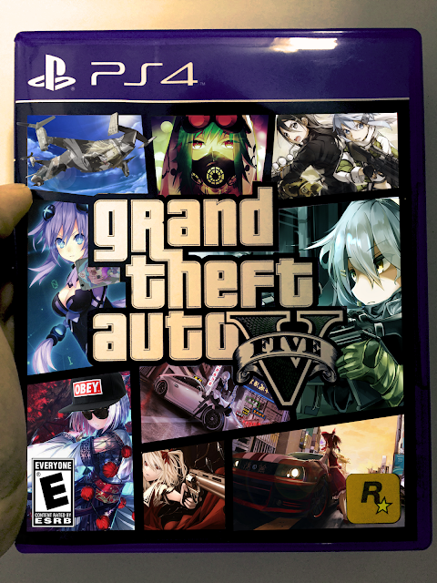
2) "Grand Theft Auto V Remastered"

4)
My work
This is my original photo

This is one of the photos I didn't end up using because of the angle I held the game at, which potentially wouldn't sync with the flat photos I would edit in.


1) I decided to do a photo-job on Grand Theft Auto (GTA V to be specific). The game is often ridiculed for being sexist in its depiction of gender roles. In the game, the characters who are male are often shown to be people who are able to handle themselves, are emotionally tough, and generally people who produce most of the work in society. On the other hand, women are shown as people who can't handle themselves, are emotionally weak, and generally as people who leech off others' (men's) productivity.

Having played the game myself, I am not going to be ignorantly bashing the game as an abomination to modern entertainment. I love the game myself and have played for hours and hours. However, I can't help but notice the way gender roles were tacitly placed into the game. You have male characters who are constantly shooting guns, engaging in combat, and breaking laws. Then you have women who are constantly in need of help, women who can't tell from fiction to reality. 

The game is known for being violent and full of action. Only for the dudes that is.


The game's cover itself already implies that those who engage in adrenaline-inducing activity are male. There is a guy on the motorcycle, Trevor (guy on the right) is hold a rifle, Franklin (guy at the bottom) is holding a handgun, and Michael (guy at the top) is wearing a gas mask as if he's preparing for combat. 

I decided to make my concept based on this. On my project, you would notice that every single one of the characters that I have placed in the game's cover is in fact, a female (well, except one of them) from Japanese media. My photo-job serves as satire against GTA, which itself is known as a game full of satire. 

The irony is that the game establishes unequal gender roles as a business tactic in order to attract a certain demographic (teenage or young-adult males) but often criticizes modern business practices with satire against the corporate world.

In my version, the characters, which are female, are holding guns, on motorcycles, and generally also have a menacing look like the characters in the original cover. Why do characters who are violent and self-capable always males? Why not female? On the other hand, why can't men also be characters who fail to handle themselves? However, one should note that my concept pokes fun at not only the game's, but also general society's depiction of gender roles. People who see my personal cover of the game will unconsciously react in shock, because it wouldn't be expected that it would be anime girls shooting guns, breaking laws, and being a social-negative. It's also a bit funny, at least in my opinion.

The third part of my concept, which is less of a social critique and more of a personal preference, is that I simply like the characters in my photo, and decided to incorporate them in a game cover, which design allows for a collage-like placement for my favorites...


This is a reference for the main, original photographs. A lot of distorting, perspective changes, filter changes, lasso-ing, other various color adjustments, and other transformations were implemented, on some more than others (Flandre, the girl with the handgun, probably took the most work).

Put together, this project represents a compilation for a dream game that I would like, as evidenced by the original photograph itself, which shows me holding the game. The fact that I'm holding it shows that it's pretty personal to me.

3) I wouldn't say I'm too happy with my work. I can say I'm satisfied though. I'm still learning Photoshop but I've been starting my own outside-of-school photo manipulations with the program and I think it's a lot of fun. For this project, there are still some flaws such as perspective problems and others that are mostly related to the lasso tool. Layer masks played a huge role for my adjustment layers, but I could have probably also used them directly for my actual layers containing my pictures too.

5) To make image adjustments for features such as brightness and color balance, I simply left-clicked the layer that I wanted to adjust, hovered over one of the "adjustment options between "libraries" and "styles", then clicked of one them. One adjustment I probably made for most of my layers were filters. I wanted my photo to be pretty homogeneous in terms of color tone. Some of my photos didn't fit well together, and I had to fix that. 

For example:


 These two photos don't really fit. One is very bright and has a lot of contrast, and the other is dark and has less of a contrast between colors. What I did was lower the contrast, brightness, and filtered the top image to make it look for fitting. After that, you can see that it at least (in my opinion) looks better together:


 I'd say I did like this project but I feel like there's a lot of improvement still out there for me. I also hope that people who view my project notice the subtle and small things such as the obey hat, sunglasses, "Rated-E", anime girl on the aircraft, among others.